2. Do something with your data
Perform searches to solve some example use cases and get a feeling for the basic Graylog search functionalities.
Basic searches
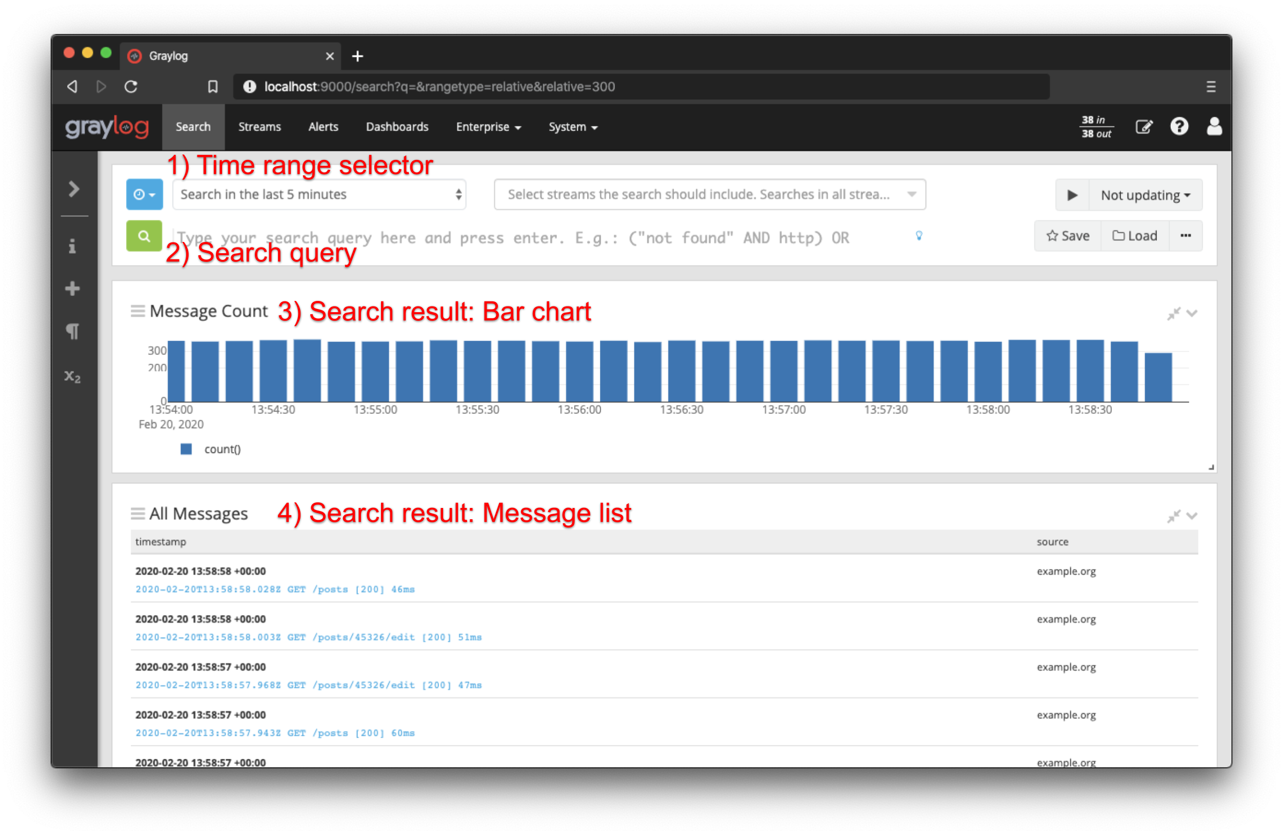
Hit Search in the main Graylog navigation, and you should be presented with an analysis of all data that was received in the last 5 minutes. Let's look at the elements of that page:
-
Time range selector
Select the time range you want to search in. Hit the blue button to select a time range type. Note that for best performance you should always choose the shortest reasonable time range. More detailed information is available in the documentation -
Search query:
Enter your search query here. You can find a full description of the search query language in the documentation. If you want to find all messages in the selected time range, you can just press enter without typing anything or alternatively use*as query. -
Search result: Bar chart
The bar chart visualizes how many messages were found per minute/hour/day/week/month/quarter/year in the selected time range. It is a great way to quickly see when how many messages were received. -
Search result: Message list:
The message list contains all messages that your search returned. Click on a message to expand it.
This is all you need to execute a basic search. The search bar also allows:
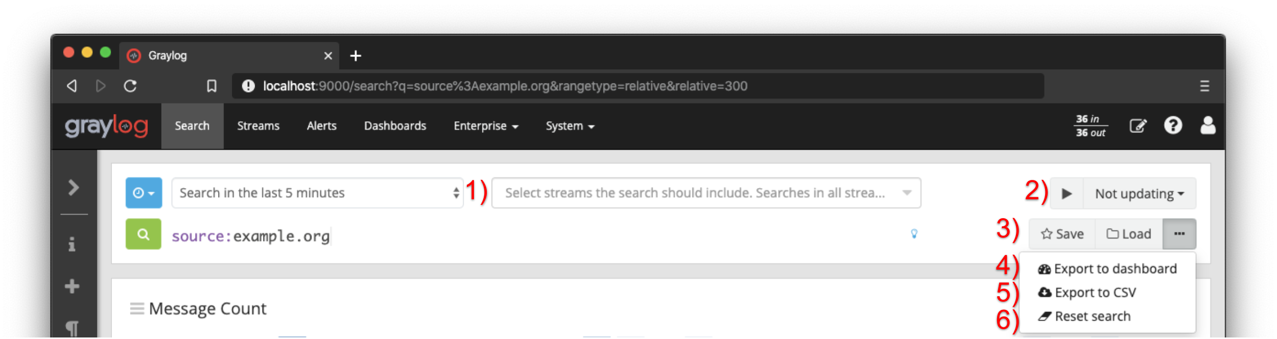
- selecting streams to filter the search results
- defining a refresh interval to execute the search periodically
- creating and loading saved searches
- exporting all configured widgets to a dashboard
- exporting all received messages as a CSV file
- resetting the search
Please have a look at the linked documentation for more information. In the next section, we will demonstrate how to visualize the search results in the context of a real use case.
Example
Let's start with a search over everything that was received in the last 15 minutes, and try to find out which
sources sent the most data.
Initially we will use the time range selector to define the desired time range.
While the bar chart and message list are preconfigured widgets, you can add a variety of different widget types to visualize the search result.
The documentation offers more information about the different widget types and the widget creation.
We will start the widget creation by adding an empty aggregation. You just need to open the sidebar and click on Aggregation inside the Create section.
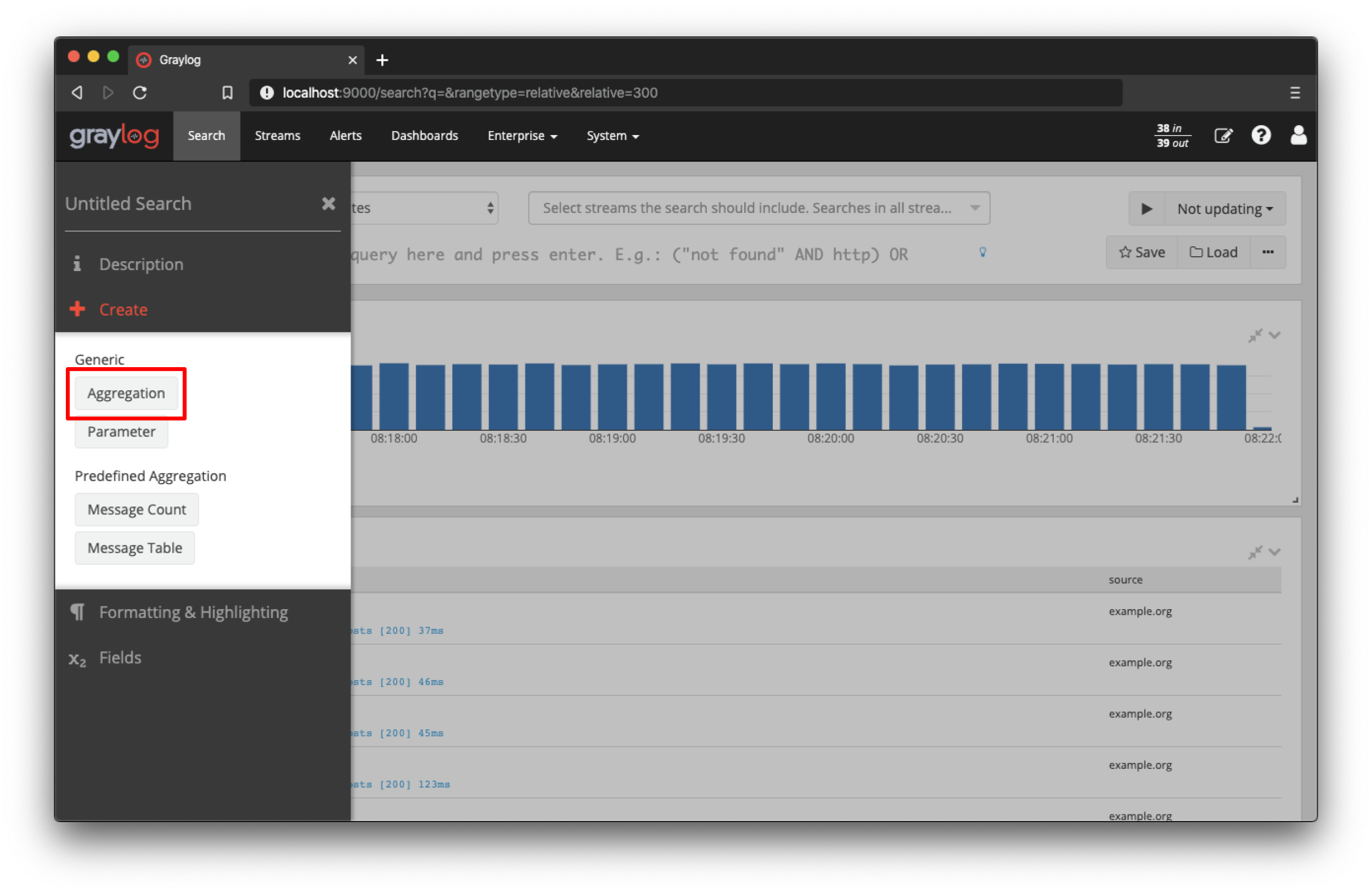
Now click on "Edit" inside the newly created widget, to open the aggregation builder.
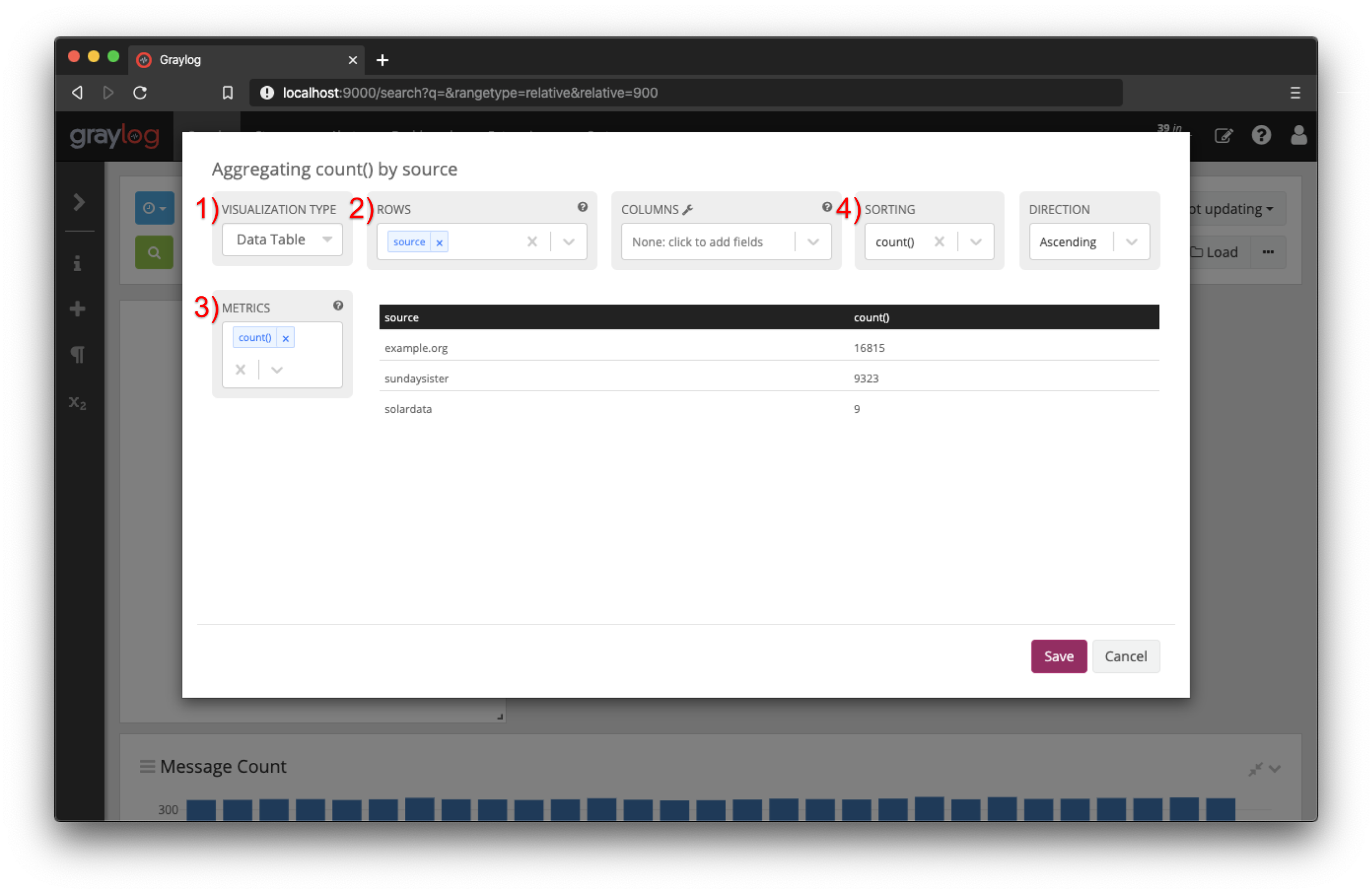
For our use case we to configure the aggregation with:
- Visualization Type: Data Table
- Rows: source
- Metrics: count()
- Sorting: count()
When you have finished to configuration, click on "Save". You can see that (in the last 15 minutes) the source example.org sent 16,815 messages in total. While the source sundaysister (a hostname of a syslog enabled device) sent 9,323 message. When you prefer to visualize the amount of messages in percent, just select a Pie Chart as visualization type. We will have a look at another example to find out what kind of data was sent by a specific source.
Let's dig deeper into the sundaysister source and find out what kind of data was sent.
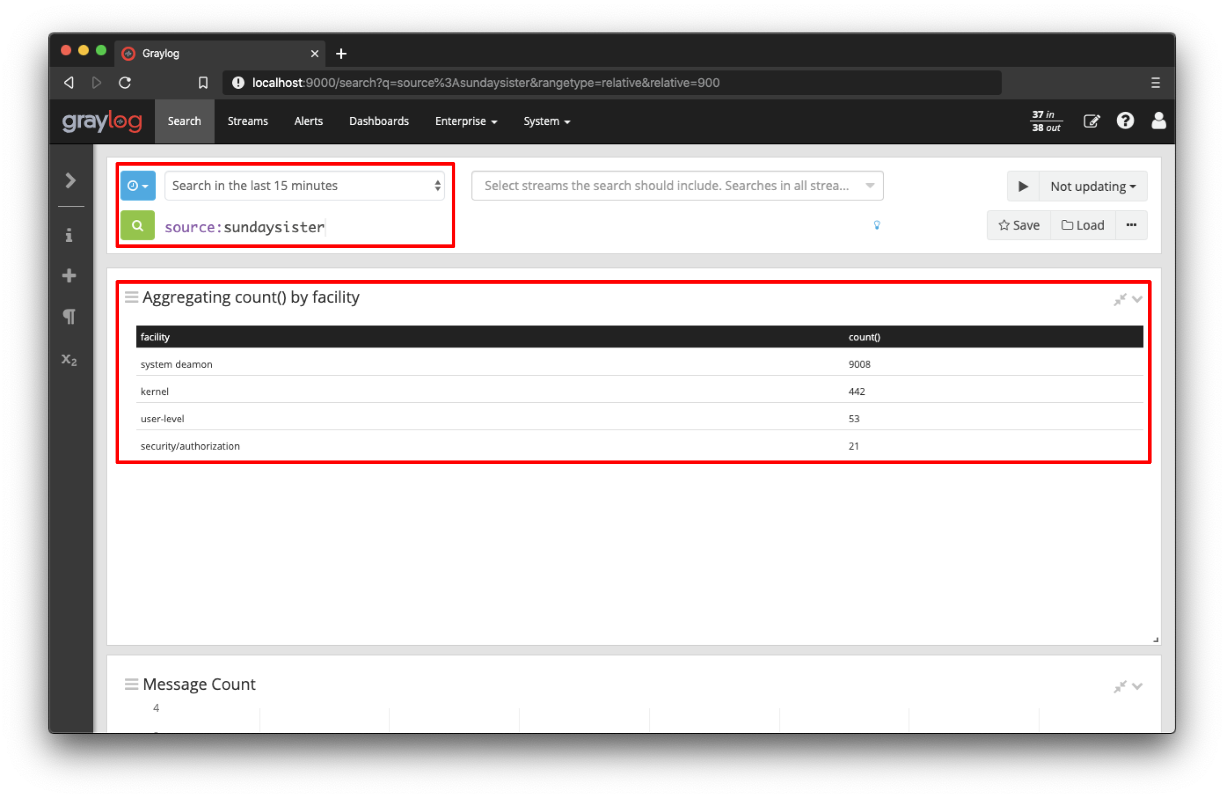
Search for all messages from that specific source (source:sundaysister) and create a Data Table widget with the exact same configuration like in the previous example,
but instead of the source define the field facility as a row pivot.
You can see that most of the messages from this source in the last 15 minutes came from the system daemon subsystems (facility).
Let's look at a third example and try to figure out the response time of a specific part of a web application. (Those structure messages can be achieved using GELF or extractors.)
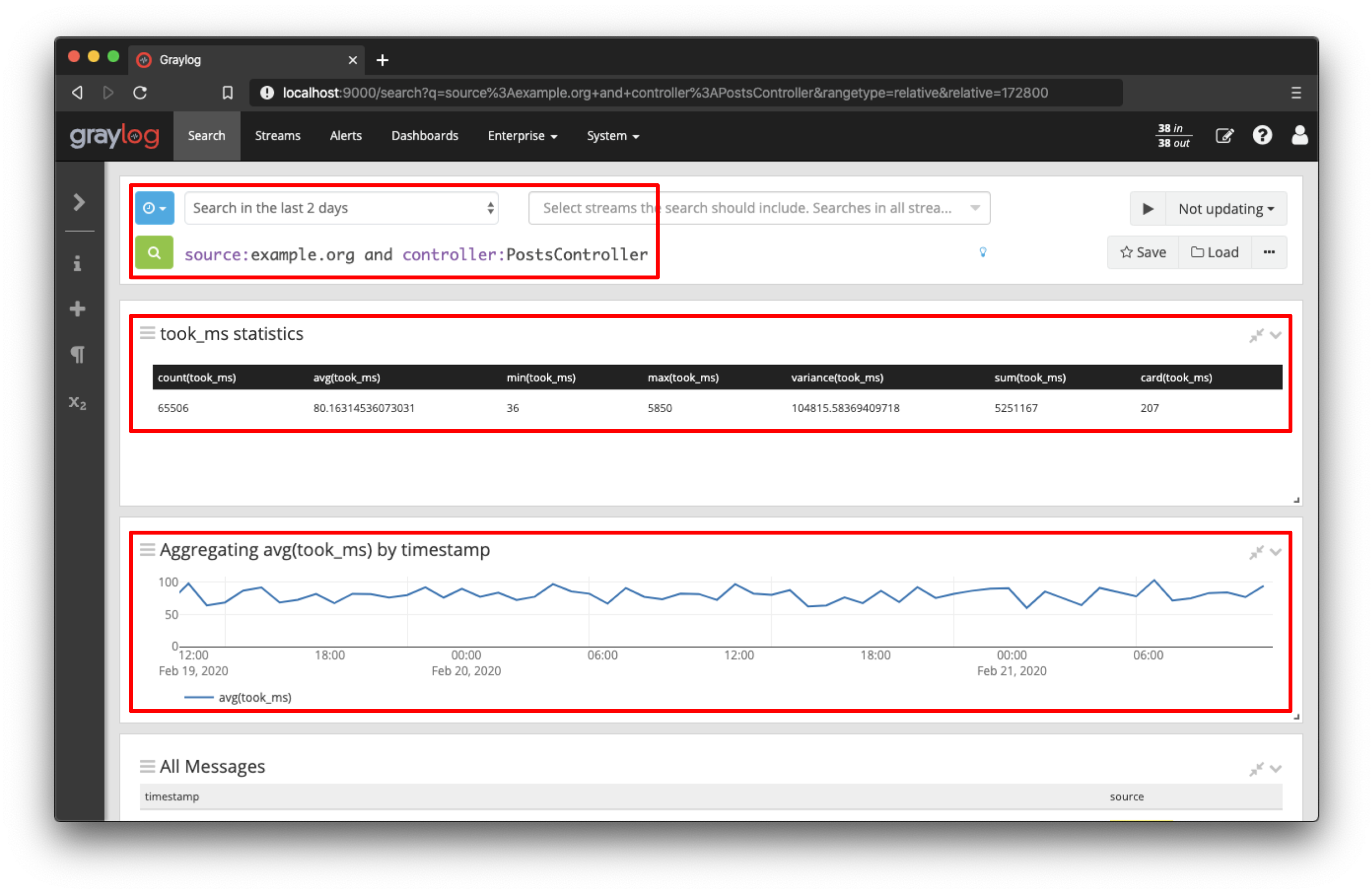
The took_ms field includes a number that represents the milliseconds it took to handle the HTTP request that was logged. The Data Table widget in the above screenshot has no row pivot configured, but a few metrics with a relation for the took_ms field.
The second widget is an aggregation with the visualization type Line Chart, which displays the average response time over the defined time range.
The widget configuration only contains the row pivot timestamp and the metric avg(took_ms).
You can see that the response time of this specific part of the application (controller:PostsController) did not
change much in the last 2 hours. You can also see that the field statistics are accurate: The average value for took_ms is around 80ms.